Pink – when the sacred became profane
No other colour has undergone a greater shift in meaning over the centuries than pink. In our cultural sphere, its meaning has undergone a complete reversal, reflecting the eventful history of the emancipation of the sexes.
Red is the colour of blood. It is associated with activity and love. Kings wore red to symbolise their power. The red uniforms worn by British soldiers in the 17th century were intended to intimidate the enemy and symbolise strength.
White symbolises purity, innocence, and holiness.
Mixing the energetic red with the innocent white produces pink. In early paintings, red symbolises Jesus Christ, while pink represents the Holy Spirit. Young rulers, or those aspiring to rule, demonstrate their claim to power by wearing pink.
A colourful display of power
In the 18th century, Jeanne-Antoinette Poisson, the mistress of Louis XV, popularised this colour code. The trendsetter chose pink as her favourite colour and gained great influence at court as the Marquise de Pompadour. Pink then became the colour of emancipation for a brief moment.
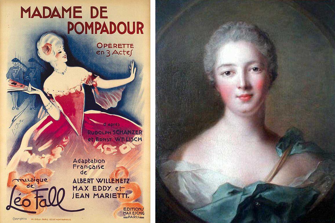
Trendsetter: Madame de Pompadour in pink, as depicted on an opera poster from 1933 and in a painting (CC BY-SA 4.0 Wikimedia Commons).
Madame de Pompadour has many imitators. Wearing pink dresses demonstrates charm and feminine self-confidence. Once the colour could be produced cheaply, however, its social decline began. It becomes the symbolic colour of the femme fatale, who performs in variety shows or works as a prostitute in seedy establishments.
Nevertheless, pink had not yet established itself as a feminine colour. In 1918, Ladies' Home Journal wrote: "The generally accepted rule is pink for the boys, blue for the girls. The reason for this is that pink, being a more decisive and vigorous colour, suits boys better, while blue, being more delicate and graceful, looks prettier on girls.'1
In the 1930s, designer Elsa Schiaparelli popularised shocking pink among the high society set. In 1939, the Daily Telegraph reported on a veritable 'pink mania'.

Elsa Schiaparelli's 'Shocking Pink' marked a revival of the colour pink (CC BY-SA 4.0 Wikimedia Commons).
Reinterpretation and trend reversal
The desire for order flourished in the post-war era. First Lady Mamie Eisenhower had a particular fondness for the colour pink. Not only were her dresses, shoes and handbags pink, but so were the furnishings in her house. In her 'Pink Palace', she stood at the stove and became a role model for a whole generation. This offered a fresh perspective on colour. 'Mamie pink' became associated with a return to traditional gender roles. Through Mamie Eisenhower's obsession, colour underwent a transformation. In 1959, Barbie entered girls' bedrooms and helped to cement the new gender stereotype.
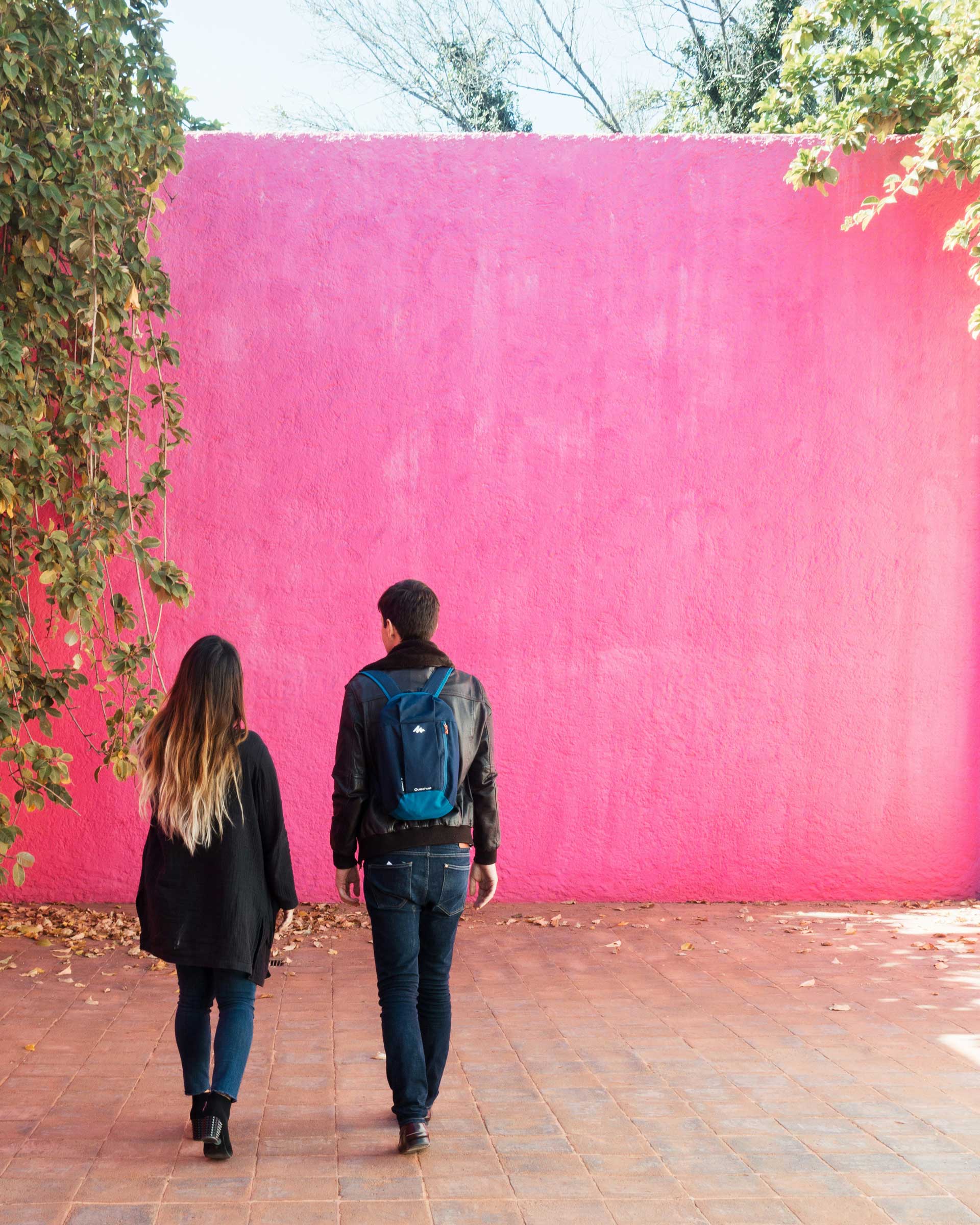
Pink in architecture
The Mexican architect Luis Ramiro Barragán Morfín is renowned for his simple buildings characterised by pink walls and rooms. During his travels in Europe in the early 1920s, he discovered the modernist movement and found inspiration in the work of Le Corbusier and Ferdinand Bac, while staying true to his roots. It was precisely this combination of modernity and traditional building elements and colours that gave his architecture its unmistakable character. This earned him the title of the first Latin American architect to win the Pritzker Prize in 1980.
Local colour in architecture: A monolithic pink wall by Luis Barragán (Unsplash/Julie Kwak)
Barragán placed pink, red and violet walls next to each other monolithically, a practice not uncommon in Mexico where rows of houses form colourful jumbles in residential areas, reflecting each owner's subjective taste. Pink in different shades became the trademark of the self-taught artist. Surrounding green inner courtyards, the walls take on an enraptured quality, creating places of contemplation. In Barragán's minimalist architecture, emptiness meets silence and light meets colour. This reflects his spirituality and religiosity.
High-tech in pink
The postmodern explosion is also evident in the 'anything goes' approach to architectural colouring. Brightly painted steel components on exposed concrete façades stand out, shaping the cityscape to such an extent that some buildings become true landmarks.
A notable example is the circulating tank of the Technical University of Berlin, which dates from the early 1970s and has become an integral part of the German capital. Oversized pink tubes extend from the functional block building. At the world's largest research facility for flow measurement, they represent the water cycle. Meanwhile, pink pipes have begun sprouting from the ground in Berlin wherever groundwater from a construction site is diverted into the Spree, inspired by Ludwig Leo's cheerful and irreverent functional building.
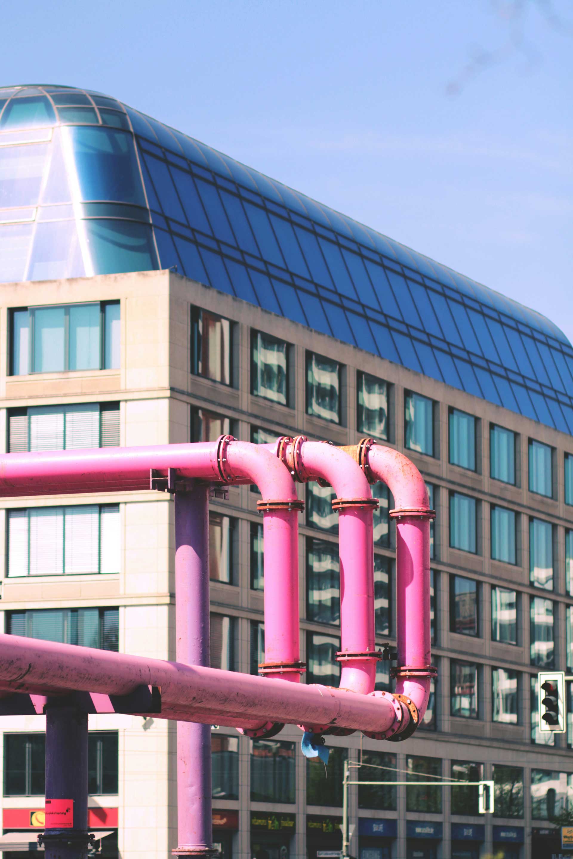
Functional and iconic: Pink sewage pipes in Berlin (Unsplash/Morgane le Breton)
In Switzerland, pink has been a topic of discussion since the early 2000s. Due to its alleged calming effect, it began its triumphant march through Swiss prisons in 2006, following its introduction in the USA. However, the effectiveness of this approach is said to be based on methodological deficiencies in the test arrangement. Other experiments carried out in Pöschwies prison have sometimes produced contradictory results. As pink is associated with gender stereotypes, prisoners can sometimes become more aggressive when confronted with candy-coloured cells.
Pink in interior design
Pink comes and goes. Interior designers' blogs and lifestyle magazines reliably report on waves of the pink trend, and rightly so: no other colour creates a setting for rooms like pink does. A touch of pink can bring a wall to life, while an entire room painted in bright pink can create a stimulating atmosphere. Whole worlds can be designed with pink.
It is said that the industry currently recognises 129 shades of pink. Le Corbusier included three in his palette: the delicate, earthy pink No. 32091 rose pâle; the dynamic 32102 rose clair; and the bright 4320C rose vif.
Regazzi roller shutters are now available in Le Corbusier's Polychromie Architecturale, including pink on request.
One thing is certain: pink is and always will be a statement.
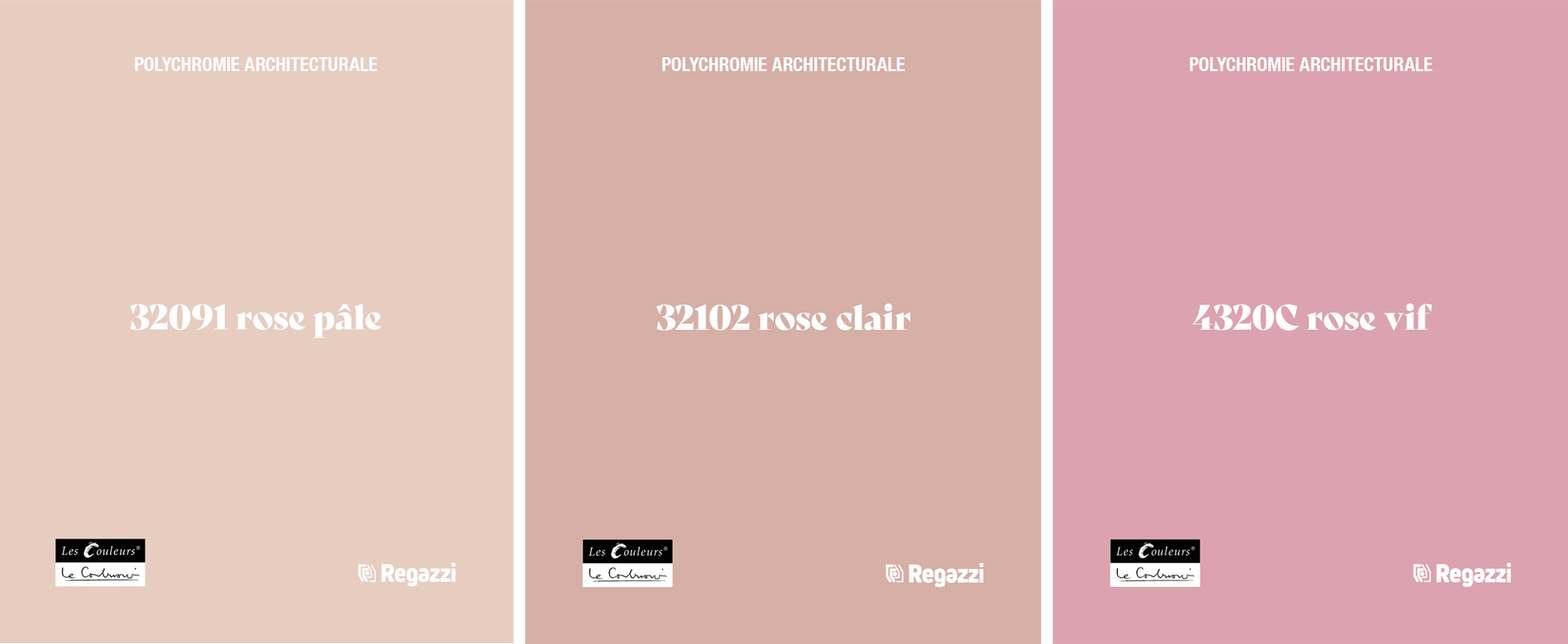
Pink shades from Le Corbusier's Architectural Polychromy
Source: Rosa – vom Zauber einer Farbe; Björn Vedder; HarperCollins Verlag
1David Byrne/Cabinet Magazin
Regazzi is a licensee of Les Couleurs® Le Corbusier®. Les Couleurs Suisse AG is the exclusive worldwide licensor of the Le Corbusier colours – granted by the Fondation Le Corbusier®. Les Couleurs® Le Corbusier® is a registered trademark of Les Couleurs Suisse AG.