Le Corbusier's colour harmonies
To encourage an intuitive approach to colour, Le Corbusier created sensual, tactile colour combinations.
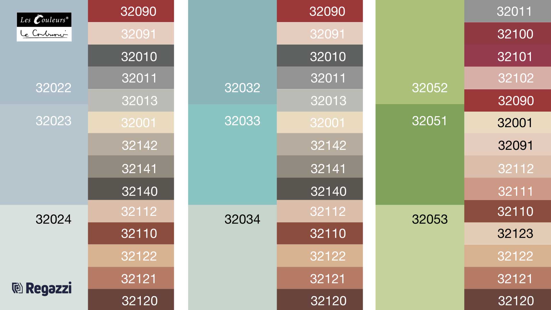
‘Room’: Light ultramarine shades (32022 to 32024) make walls appear to recede into the background. Le Corbusier recommends combining these shades with red ochre, brown, umber and grey (left).
‘Sky’: The light cobalt blue (32032 to 32034) makes the room appear larger. It goes well with white, red ochre, brown, umber and grey (middle).
‘Landscape’: The green shades (32051 to 32053) contrast optimally with red ochre, brown and red (right).
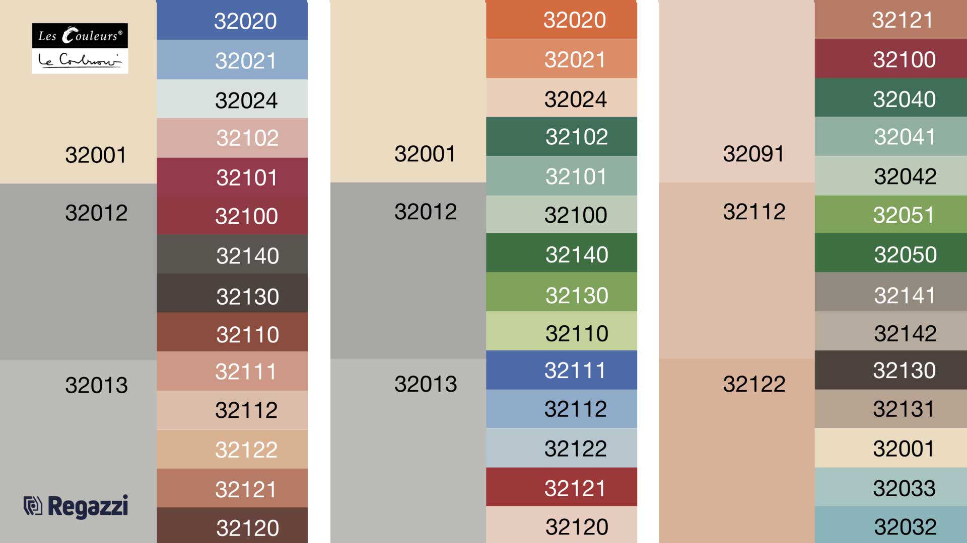
‘Velvet’: Le Corbusier recommends contrasting shades of green with a wall in White 32001 or Light Grey 32012 or 32013. Orange, blue and red also complement it well (left: velvet I, middle: velvet II).
‘Wall’: The light terracotta shades (32091, 32112 and 32122) look best when mixed with green, blue, red and brown shades (right).
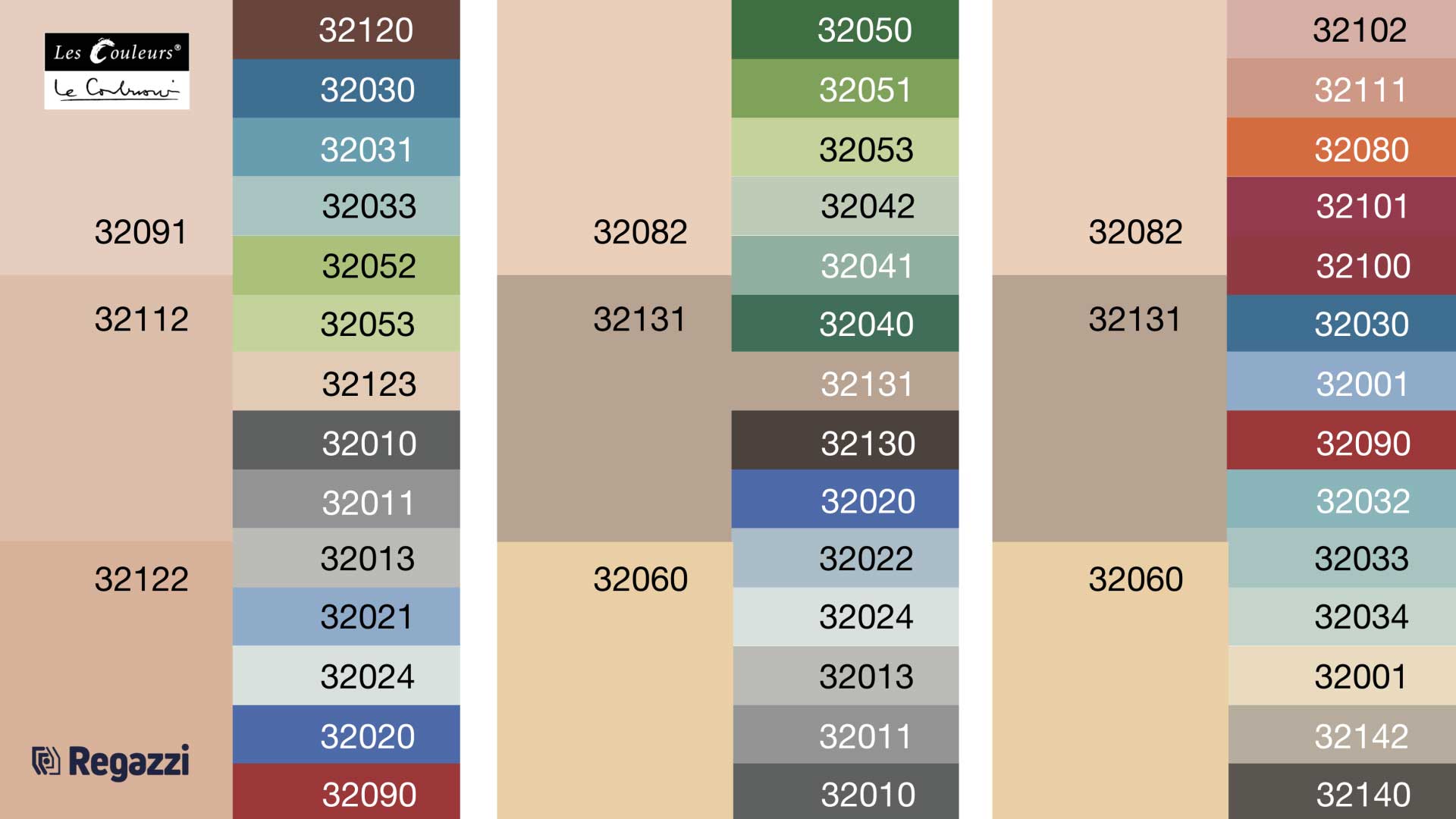
‘Sand’: The three wall colours (32060, 32082 and 32131) are ideal for use with grey, blue, green and umber (left: wall II, middle: sand I, right: sand II).
Regazzi is a licensee of Les Couleurs® Le Corbusier®. Les Couleurs Suisse AG is the exclusive worldwide licensor of the Le Corbusier colours – granted by the Fondation Le Corbusier®. Les Couleurs® Le Corbusier® is a registered trademark of Les Couleurs Suisse AG.