Eminent architectural colours for confident interior design

With 2540 RAL colours, 2390 Pantone colours and 1750 NCS colours available, it's no surprise that architects and interior designers are often overwhelmed when it comes to colour design. A standardised palette that can be used across different applications can be a great help here.
This is precisely the purpose of Le Corbusier's Polychromie Architecturale: developed as a tool for the targeted use of colour in architecture, its stringent palette rules out unsuitable combinations from the start. A variety of achromatic and coloured shades with different brightness levels allow for great design freedom.
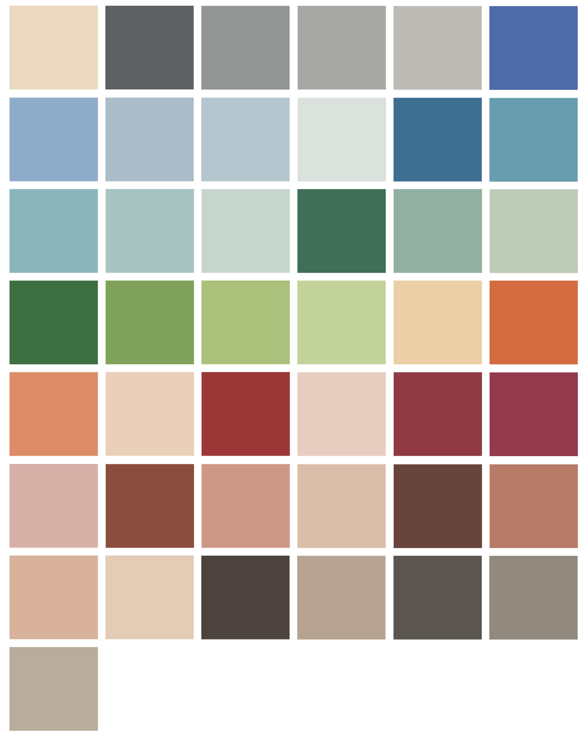
The natural colour palette of 1931
In 1931, Le Corbusier was commissioned by wallpaper manufacturer Salubra to define 43 colours taken from nature that were ideal for use on walls. To encourage an intuitive approach to colour, he created sensual, tactile colour combinations such as ‘space’, ‘sky’, ‘wall’, ‘velvet’, ‘sand’ and ‘landscape’. The colour names in the original palette are five-digit numbers, always starting with 32.
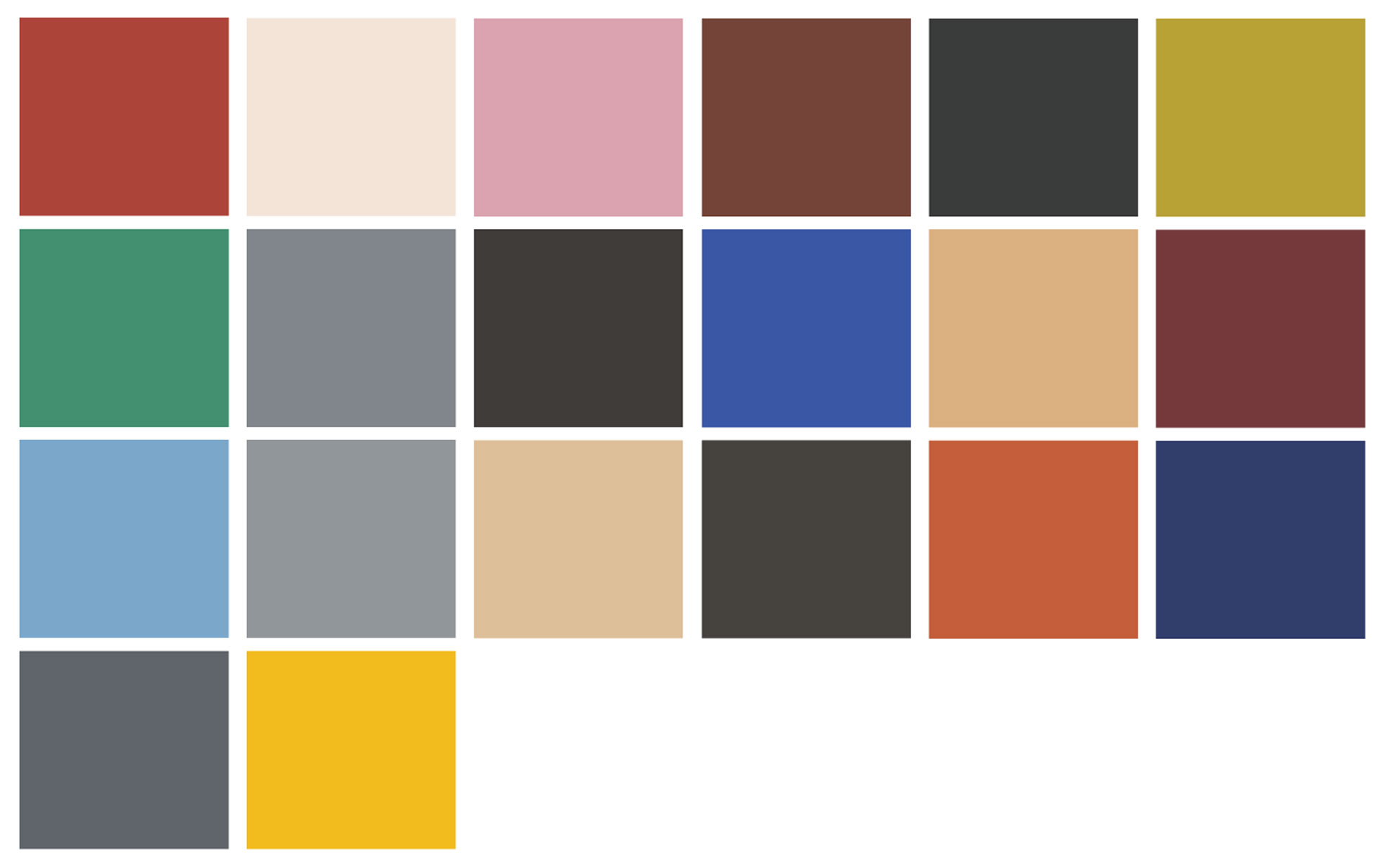
The contrasting colours of 1959
In keeping with the spirit of the times, Le Corbusier added 20 bold and stimulating colours to the palette in 1959. These colours blend harmoniously with the existing 1931 palette, completing the Polychromie Architecturale and making it a timeless tool for architectural design. The colours are preceded by the code ‘4320’ and range from ‘4320A’ to ‘4320W’.
Standardised across all licensees
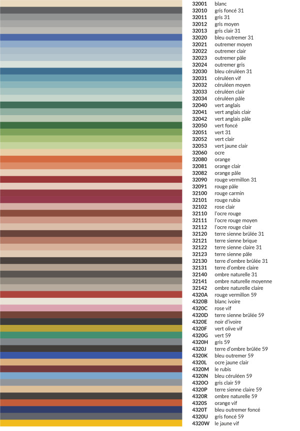
Le Corbusier was not only a great architect, but also left behind an extensive body of work as a painter, draughtsman, sculptor and furniture designer. The colour palette he developed is therefore suitable not only for walls, but also for a wide range of architectural applications. From window fittings and roller shutters to carpeting, the 63 colours are standardised across all licensees, allowing for a holistic and harmonious approach to interior design. Selected licensees are permitted to use the colours for their products. They share with Le Corbusier a commitment to quality and a desire to create timeless designs.
Le Corbusier's Polychromie Architecturale at a glance:
Regazzi is a licensee of Les Couleurs® Le Corbusier®. Les Couleurs Suisse AG is the exclusive worldwide licensor of the Le Corbusier colours – granted by the Fondation Le Corbusier®. Les Couleurs® Le Corbusier® is a registered trademark of Les Couleurs Suisse AG.
« Colour is intimately attached to our being. Each one of us has perhaps their colour; often we may not be aware of it, but our instincts are always right. »
Le Corbusier
The effect of colour on a room
White
White makes the shape and size of an object stand out from its surroundings. A white wall provides the greatest possible contrast to a coloured object. White is never neutral. In architecture, pure white is even highly controversial. The two shades of white in Polychromie Architecturale are off-white, corresponding to creamy white and chalky ivory.
Grey and black
These colours make walls and objects disappear into the shadows. Le Corbusier recommends using dark grey, particularly in shaded areas. A room decorated in shades of grey has a calming effect on the senses. Le Corbusier included seven shades of grey and one shade of black in his colour palette.
Blue
Blue colours bring the outdoors in and make rooms appear larger. A blue wall takes a step back and allows other objects to take centre stage. Whether cool or warm, calming or sober, blue is the declared favourite colour in our cultural sphere. Blue is also strongly represented in Polychromie Architecturale, with a total of thirteen shades ranging from ultramarine to grey-blue to sky blue.
Green
Whether dynamic or restrained, airy or heavy, Le Corbusier compiled seven shades of green for architectural use, each with a different effect. Dark green with a high proportion of blue makes walls appear to recede. Conversely, the bright green with a high proportion of yellow makes the room appear larger. The broken green with a tendency towards grey provides a neutral backdrop for the activities in the room. Psychologically, green is said to have a balancing and calming effect, particularly when reminiscent of forest colours.
Ochre and yellow
Earthy and sunny, ochre walls create a Mediterranean atmosphere that is both welcoming and friendly. They let in light and make the room appear larger. There are three shades of ochre in Polychromie Architecturale, but only one shade of yellow. This is because yellow should be used with caution, only in areas that receive plenty of sunlight. It is only then that it really comes into its own.
Orange
Energetic and radiant, orange can quickly appear artificial and overwhelming. Le Corbusier's colour palette includes three bright orange tones and a sandy pale orange that is also suitable as mural colour.
Red
Stimulating and powerful, Polychromie Architecturale offers eight shades of red, ranging from bright red to pale pink and fuchsia. Red accentuates the materiality of an object. A dark, intense red makes a wall appear more solid. Pale pink, however, is more subtle.
Red ochre and brown
Natural tones such as red ochre and brown played a major role in the early colour palette defined by Le Corbusier. He created eight shades of these colours in 1931, adding a dark, deep brown in the late 1950s. In traditional historical architecture, these colours accentuate the structure of the surface, bringing it to the fore. The paler the colour, the more subtle and neutral its effect.
Umber
Umber casts objects in shadow, yet it appears more vibrant than grey or black. Le Corbusier's colour palette features seven natural-looking shades of umber.
“For me, windows are the 'face' of the house.”
Interior designer Mierta Lazzarini explains what guides her when choosing colours and why a house can squint.
Pink: a colour that makes a difference
What happens when you mix vibrant red and innocent white? The result is a colour that redefines the rules.