The Master of Colour
A building's form is not the only factor that makes an impression; its colour is important too. Even though colour is applied at the very end, the colour concept must be considered from the outset. With Polychromie Architecturale, Le Corbusier created a harmoniously coordinated palette of colours. Regazzi roller shutters in Polychromie Architecturale expand the possibilities for colour design in construction.
Le Corbusier mastered white through colour. He once said that all houses should be white by law. On another occasion, he likened a pure white house to a cream jug. In Le Corbusier's architecture, you will search in vain for a brilliant cream white; instead, white is found in all shades, such as chalky ivory or cream white. White makes the building stand out from its surroundings and emphasises the clean lines of modern architecture. Le Corbusier uses dark colours for components intended to be subordinate. This principle is clearly evident at the Villa Savoye in Poissy, where the set-back dark green ground floor blends into the vegetation, allowing the upper floor to dominate in terms of colour. The building appears to be supported solely by its columns.
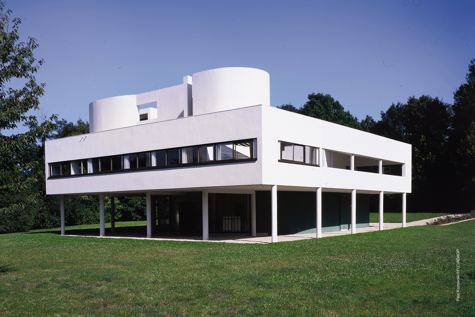
As if supported solely by its pillars: Villa Savoye in Poissy
When the painter entered the field of architecture as a self-taught artist in 1924, he incorporated colour into his designs right from the beginning. He said: ‘In architecture, colour is just as powerful a tool as the floor plan and the section. In fact, it is polychromy itself that is a component of the floor plan and the section.’1
Eminent architectural colours
However, the use of colour in architecture differs from its use in painting. When applied to large surfaces, the effect of colour is heavily dependent on daylight. The interplay of light and colour is altered by the weather, the position of the sun, and the direction in which the building faces. Le Corbusier experimented with pigments and binders. He wanted to determine the colours that worked best on buildings. He describes these colours as ‘eminently architectural’.
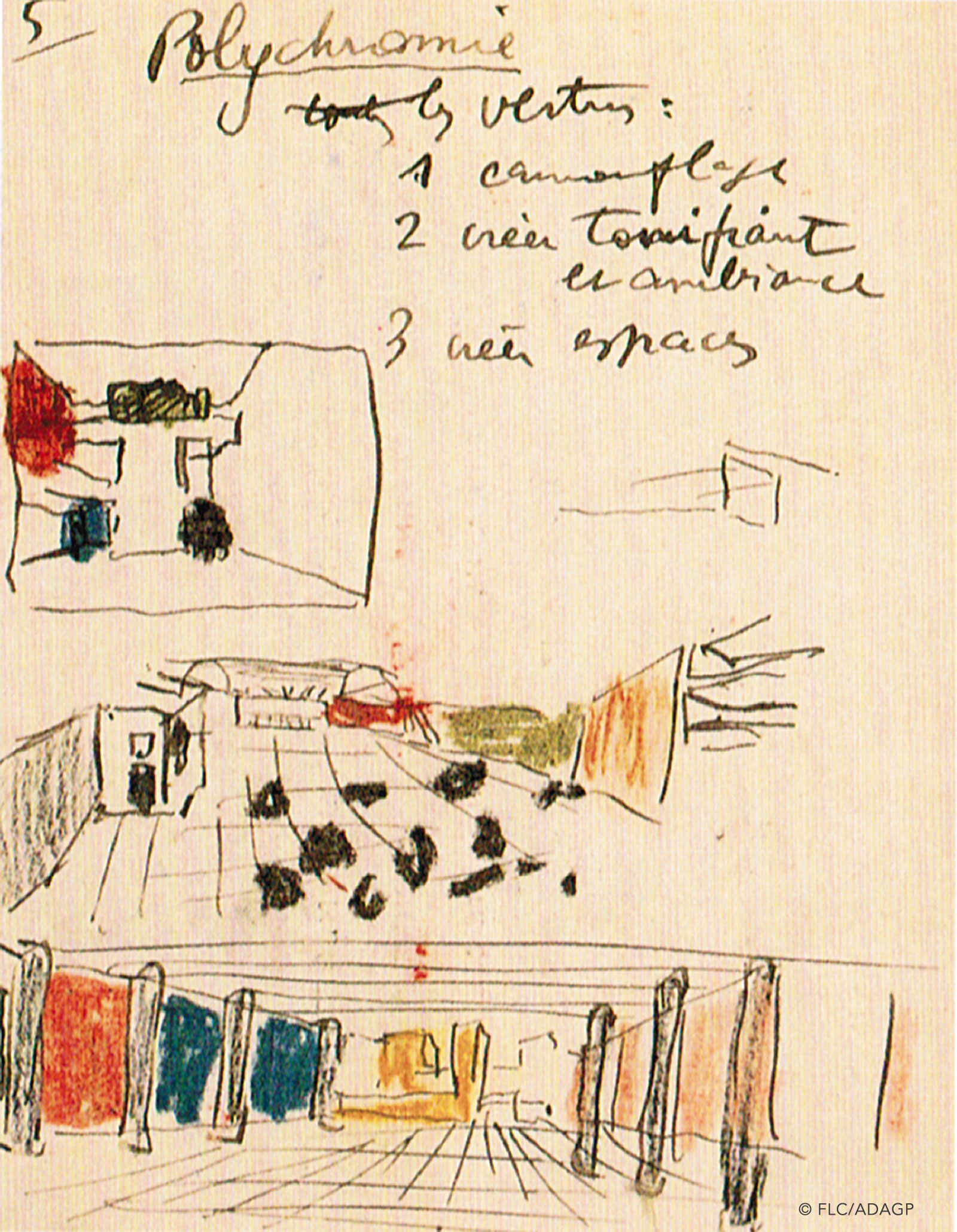
Le Corbusier's design sketch with colour scheme
The commission from the Basel-based wallpaper manufacturer Salubra to create a colour collection for wallpapers suited him well. It gave him the opportunity to standardise part of his colour palette. ‘First of all, I eliminated most of the pigment colours. I kept ‘the noble scale’: white, black, ultramarine blue, shades of English green, ochre yellow, natural sienna, vermilion red, carmine red, English red and burnt sienna. For each of these shades, I looked for the most effective values from a wall perspective. Once I had done this, I had 43 shades. I could certainly have had more, but I didn't want to get bogged down.’2
A tool for purposeful work
The 43 colours from the 1931 scale can be freely combined with one another: ‘They seem to me to be a tool for precise, purposeful work. They allow modern homes to be given a strictly architectural colour scheme that also meets the individual's deep needs.’3
La Maison Roche: Le Corbusier's fondness for colour was evident even in his earliest work, dating back to 1923.
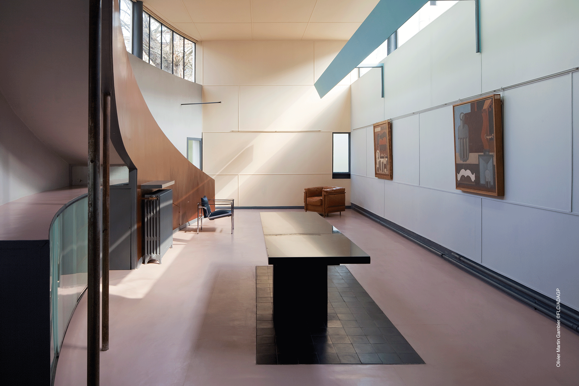
Le Corbusier never uses colour arbitrarily, but always with regard to the intended effect. Colour structures the space, creates cohesion between parts of the building and dissolves volume. There is a ramp whose stability is visually enhanced by a strong reddish-brown colour, and a light blue wall that makes the room appear wider. Colourful window recesses tint the incoming light and coloured glass blocks create atmospheric accents.
The detachment of colour from the object
For the extravagant Philips Pavilion at the 1958 World's Fair in Brussels, Le Corbusier created a multimedia installation combining sound, film and photography, all bathed in coloured light. Here, the colour dematerialises and detaches itself from the wall. This allowed him to achieve what he had long been pursuing in his floor plans: the open playability of the building's boundaries.
Technical developments in the 1950s and 1960s expanded the possibilities of construction. Le Corbusier built structures from exposed concrete and accentuated them with bold primary colours. Artificial colour pigments replaced natural colours. Consequently, his second colour palette for Salubra in 1959 was more vibrant. The 20 colours could be combined not only with each other, but also with the colours from the first palette.
The building that best exemplifies his later preference for bold colours is undoubtedly the Heidi Weber House in Zurich. Its exterior is divided into white and colourful squares, while natural materials dominate the interior. Unfortunately, he did not live to see the building completed. He died in 1965, two years before completion, with the project being taken over by Jean Prouvé.
Revival of the colour palettes
Today, Les Couleurs Suisse AG grants licences for the use of Polychromie Architecturale under the name ‘Les Couleurs® Le Corbusier®’. As well as wall paints, carpets and window and door frames, architects and planners can purchase Regazzi's premium roller shutters in Le Corbusier colours from retailers. With 63 colours to choose from, the roller shutters offer a new way to design building envelopes and interiors holistically and harmoniously – because colour comes from within.
Sources:
1 lescouleurs.ch
2 Arthur Rüegg: LeCorbusier, Polychromie architecturale. Pubslihed by: Arthur Rüegg. Birkenhäuser Verlag, 2016, ISBN 978-3-0356-0661-4
3 Das Werk: Architektur und Kunst = L'oeuvre : architecture et art. Band 18 (1931)/ ETH Library Zurich, E-Periodica

Regazzi is a licensee of Les Couleurs® Le Corbusier®. Les Couleurs Suisse AG is the exclusive worldwide licensor of the Le Corbusier colours – granted by the Fondation Le Corbusier®. Les Couleurs® Le Corbusier® is a registered trademark of Les Couleurs Suisse AG.